|
Naming a ring after oneself does raise a few questions, and I might as well answer them. No, this is not a ring
for people named "Joe Dunphy", though I could probably get more applicants that way than one might think, the name
being, as one exasperated writer put it, "the Irish equivalent of John Smith". I was much amused to discover that I
wasn't even the only Mathematician by that name in Chicago, and if one threw the net out a little further and took
in the whole Chicago area, one could find people who matched me by middle initial, religion and profession! You'd
think there wouldn't be that many Jewish Dunphys, but I guess our friend working in immigration was having fun that
day. (The family name was originally something else, before it was changed with the stroke of a pen, a fate suffered
by the names of many immigrant families in the past). |
|
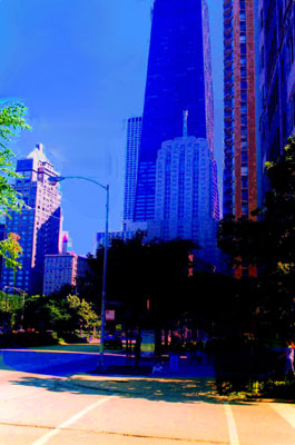
You begin, perhaps, to see some of the problem. Part of it is the limitations presented by the equipment available to me. I am poor, so as much as I would like to have access to my own darkroom, I don't. I have to submit my pictures to cheap third party processing and then compound the injury by running the picture through a nonprofessional grade scanner - at least, until I have access to a good quality digital camera with control over the field and focus, sort of a digitial version of the manual pentax - and don't hold your breath on that one. What I have to do, and indeed most amateur photographers have to do, is photoshop the image after the fact to repair the damage done, and sometimes one can get fairly decent results. |
|
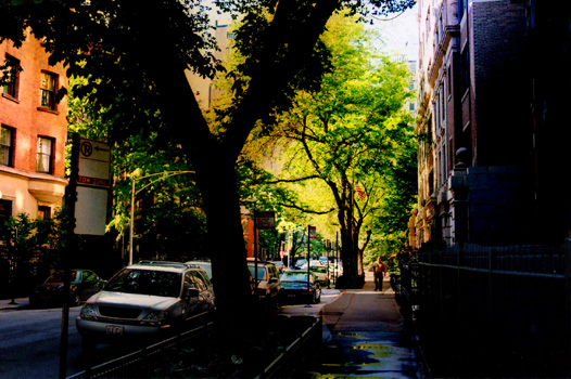
It's not everything that I want it to be, but progress is being made. Why did the second image turn out so much better than the first? Partially, this may just be a matter of my having done a better job on the second image. A point sometimes missed in all of the online dismissal of photoshopped images is that the shopping of a photo is not simply a running of the image "through filters which anybody can use"; one isn't just pushing a button and having a computer do everything. One is carefully selecting portions of the photo, tracing boundaries by hand as one does a virtual dodge and burn, and otherwise enhances a variety of regions within the image in the way that each need to be enhanced. This is trial and error, far more art than science and yes, it takes practice, practice I'm still getting. But that's not the only difference. Yes, what I do matters, but the two images, you might say, don't start at the same point. The second photo presented me with a better starting point than the first did, by far, as several tries to get the first to look less like a watercolor have shown. What you see in the second image is close at hand, while that you see in the first, as would be the case with most Loop imagery, is far away, everything being "at infinity", which tends to make for a very flat looking image. Obviously, the professionals can overcome that limitation and do, but doing so is not as easy as one might think. What makes the Loop an even more difficult subject for photography is the plainness of the larger structures, and with this, we begin to get into problems that practice will not necessarily help the online amateur photographer to get past. If you take a look at the successful Loop imagery that is to be found online, one will notice something about it - the images tend to be fairly huge, on the order of over a megabyte, at the very least. Even if my visitors were willing to patiently sit and watch such images load, which I seriously doubt, finding somebody to host such images would be difficult and I'd run out of bandwidth allotment very quickly. I'm forced to reduce the size of the images, a necessity that I sometimes try to make a virtue of, as in the case of this image, as I accept and embrace the unreality of the process itself. |
|
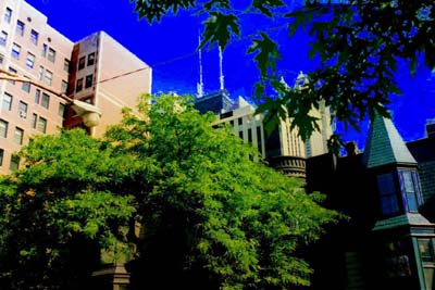
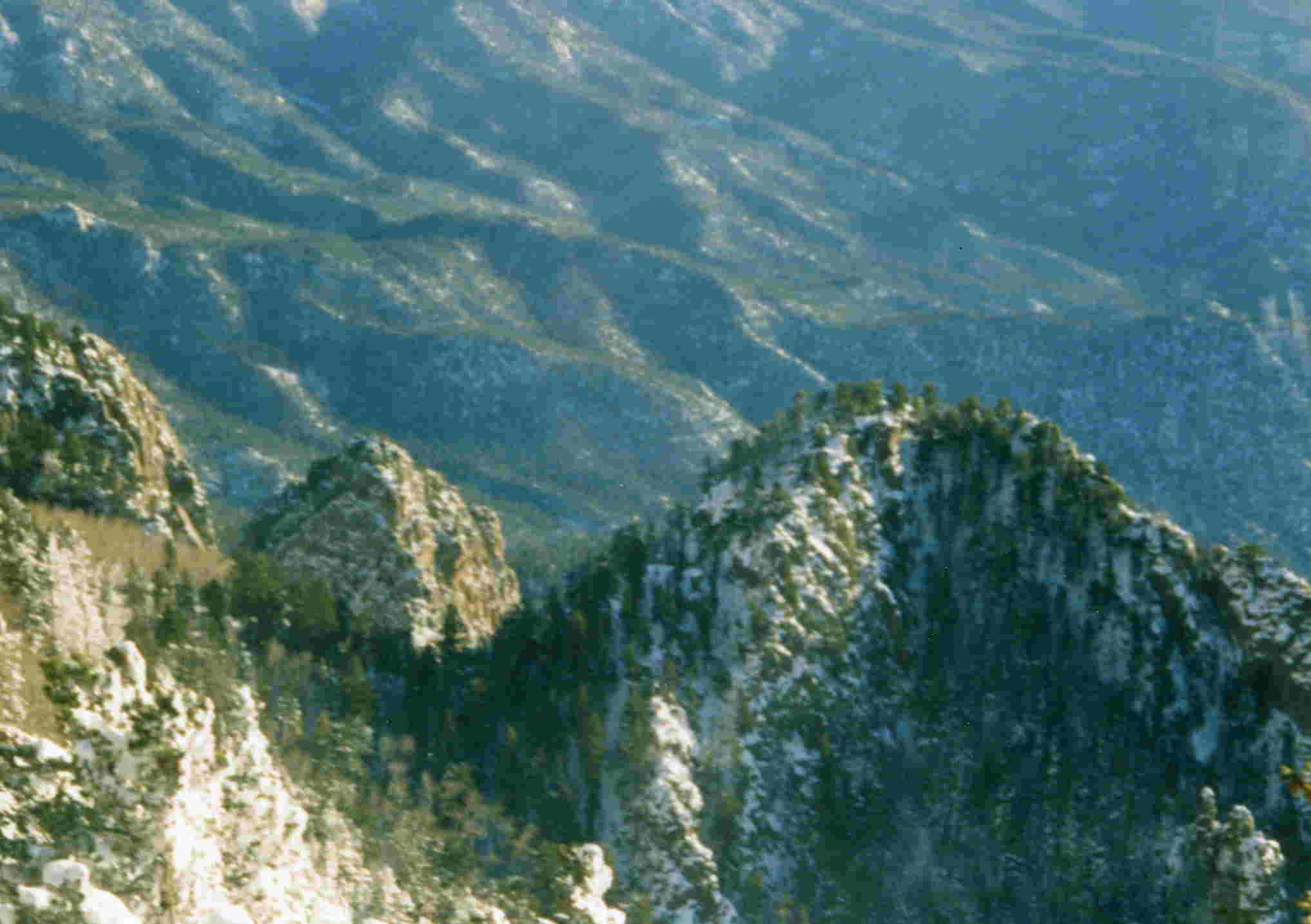
Depending on your monitor, you may see something looking pleasantly, strangely impressionistic or crudely pixelated and coarsely unconvincing. One of the frustrations in doing online work is that the same page will not appear in the same way on all screens, and most annoyingly, this turns out to be true of images as well. I'm not entirely sure of why that is, but if you are using a monitor similar to the one I was using when I did the photoshopping, what you will see will be a surrealistic image of a home on the near north with the towers of the Magnificent Mile in the background, that seems to gradually transition between looking entirely real (home in the mid foreground) to not at all real (the leaves looking painted in, as well as the towers), with no sharp transition, as if the photo were forming itself out of a watercolor. That was deliberate, and part of the story in a sense - struggling against the limitations of the format was part of the experience. A 250K image just isn't reality, it is at best suggestive of a reality in a way that can't help but leave the viewer noticing that he is being given a suggestion. If one accepts that, one can have fun playing with the concept, but in the case of that look down the inner drive, the fun quickly disappears because the process becomes one of all give and no take. No part of the image ever becomes convincing; one doesn't have reality struggling to free itself from the abstraction in which it is embedded, one simply has a cartoon, and a lifeless looking one at that. "Then why include it in that gallery at all?", you might ask. The answer is "because I wasn't just showing images, I was telling a story, and there's no way of following that path without the fact of having stepped onto the drive making an impression on one"; to leave out the image would have made good decorative sense, but it would have been wrong from the standpoint of narrative, which is a consideration you'll find coming up repeatedly on this ring - photos, as they appear, almost always either do so in some sort of narrative context, or are on their way to doing so. If as an amateur photographer, I'm trying to get you to see through my eyes, if only for an instant and with limited success, then I have to recognize that whatever is seen through my eyes is filtered through my point of view - images as I'm seeing them do not simply exist for me as disconnected patterns of light and dark, color and shade, but in my reaction to all of that as well. The context matters, and so there are some things that I can't just leave out, as unsatisfied as I may be with them at the moment. The best I can do in such a case is come back, at about the same time of year I shot the originals (well into summer), at the same time of day (3 pm, I believe it was), and replace the unsatisfactory images with ones I am more pleased with. "But is that not dishonest, because the images we see are not the ones you saw on that day?" Not at all. I saw a virtual infinity of images on that day, I just didn't record all of them, and while the hike you see is recorded as a single event taking place on a single day, with all of the hiking I've done in that neighborhood, it is a day that one might say that I've had many times. Maybe even a few too many, and the experiences do blur together, so to lump the experiences together, while it may not seem to be a telling of the literal truth, nevertheless tells a kind of truth about the experience. That having been said - what went wrong with the first image? What needs to be changed in the composition, if the replacement image is to be an improvement over the original I posted? Let's take a look at this image of some of the landscape below Sandia Crest near Albuquerque. Believe it or not, the hills you see stretching below were no closer to me than those office towers were when I looked down the drive. Distance can't be the whole story, and neither can experience - I shot the images at Sandia Crest well before I shot the ones on the Gold Coast. |
|
The more distant hills look a little bleached out, something that needs work, but they don't look anywhere close to being as flat and cartoonish as those office towers did, despite being much further away. Why? A better question, I think, might be why when we look at such buildings with our own eyes, we see something that looks like reality and not a cartoon. Think about that question for a second and don't just react to it - why do our eyes succeed in seeing reality, where the camera often fails, especially in a digital context? What makes reality look real to us, and how do we distinguish it from the cartoon? If you think about that, I think you'll see why the necessary compression of images online can present a problem. That the buildings in the Loop tend to look flat and featureless in the images you find in some of my galleries is not entirely an illusion. Chicago was badly mauled, architecturally, in the name of Mies Van Der Rohe and his modernist successors. Downtown Chicago facades often look flat and featureless in photography because, in reality, they are fairly flat and featureless. But they're not entirely flat and featureless. There are still windowsills, shadows, and other "imperfections" that give life to what would otherwise be lifeless, and the human eye picks those out, as it tends to pick out anything out of place. But the camera doesn't, and when one reduces the size of an image, those very small out of place details that the eye picks up in real life, are quickly lost. Unexpected detail is what makes reality look recognizably too rich to be a cartoon, and unexpected detail is what we lose. As far off as the receding hills at Sandia Crest may have been, one didn't know in advance to know to expect a shadow here, a rise there - and the unanticipated details that show the three dimensionality of the landscape aren't so small as to be lost in the image size reduction. There are enough cues left in place that the eye can look and see that while the image itself isn't real, it speaks of something that was real. This is why I don't tend to view Loop photography as being a promising subject for small file - 350K or less - photography. Like the miniature offline, I think we have to see the small image online as a distinct artform in its own right, with its own limitations and virtues, albeit a form that seems neglected by professionals very often, and part of such a recognition is the acceptance that some subject matter is not apropo for a given form. What, then, would be fitting? I'll be experimenting with that soon enough, but seeing what has worked and what hasn't has given me a few thoughts about what to try. When I was shooting the first Chicago images, I was out on a bright, sunny day, so when I shot that first image, placing many, many brightly lit and large towers in the bulk of the field of view, I shoved what nearby and nonflattened detail there was in a shadow just above the lower right hand corner of the screen. Osco is not going to dodge and burn; a lot of detail was lost in the developing, including a sizable crowd that was passing under the trees at the moment I shot. What I should have done, and didn't, was focus more on what was under the trees, letting the alleged subject of the photo - the Loop laying beyond - fight its way into the margins of the photo, where it would still be noticed, instead of just freely giving it the bulk of the image. It'll still look a little flat, but having been rewarded with rich imagery in the foreground, I think the eye may be a little more forgiving of the unreality beyond. But I could be mistaken. I'll find out, and get back to you on this page about the results when I do. Is that all you should expect to see on this ring, then, my and maybe my friend's experiments with small file photography as we try to beat the developers to record places worth remembering? No, though that certainly is and will be one of the topics. You're going to see a sampling of a few subjects I find to be of interest, which is not to say a coverage of everything I find to be of interest, just some things that came up along the way, sort of offhandedly in the context of the strangeness discussed elsewhere in this cluster of sites of mine. In the course of a writing a centrist blog, I get to butt heads with political extremists on both ends of the political spectrum. One thing that the Far Left has gained just notoriety for in some circles has been its abuse of Statistics. "Somebody did a study" is a line that has been heard uttered by activist after activist, accompanied by an attitude that all studies are be to taken on faith, as long as the activist likes their conclusions and they're the first studies cited on a topic, of course. I would like to see the reader be sophisticated enough on the subject to not be willing to be as credulous as some would ask him to be, and on this subject, I can write as a professional. What was and has been an annoying experience, then, also becomes a sort of opportunity, in that it points me toward something worth doing. The main page of the site you're currently on is being written, offline for now until there's more to see, as a basic introduction to Statistics for those who wish to be able to intelligently rebut some of those who have been misusing it fraudulently along with an occasional illustration of the fraud in a social science context. Expect no soundbites or any acceptance of them. I've been to graduate school in Mathematics, I know what is and is not a rigorous argument, and I have no patience with those who expect me to accept nonsense in order to be a good sport about the whole thing. The coverage will be on the undergraduate level, up to about the equivalent of senior year, and will include some of the basics of Probability Theory and Multivariate Calculus, including worked problem sets. I've made a few contacts in the process of helping a few people with their homework, online, so maybe I'll be able to get a few more Mathematics and Statistics sites on this ring, but I can't promise anything yet. "Just Mathematical Statistics and Photography, then?" No. In the course of the camping related incidents some of you may have heard me discuss, I've found myself assembling (or trying to assemble) a kitchen for feeding hungry fellow travellers, so look for some wheatfree African and Latin recipes, and maybe a few other things as well, some of which I hope you'll find useful or at least interesting. If you'd like to know when my sites are going to be updated, my homelist is available for that, and the top navbar will take you directly to the ring. |
